There are no shortage of opportunities to improve engagement and infuse MCC's (occasionally) text-heavy analyses and reports. From blogs, to economic assessments, presentations to congressional briefers, I'm always discovering and driving ways to make the communications as accessible and captivating as possible.
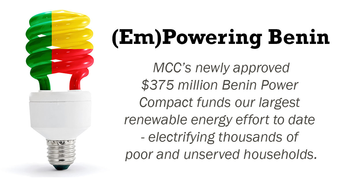
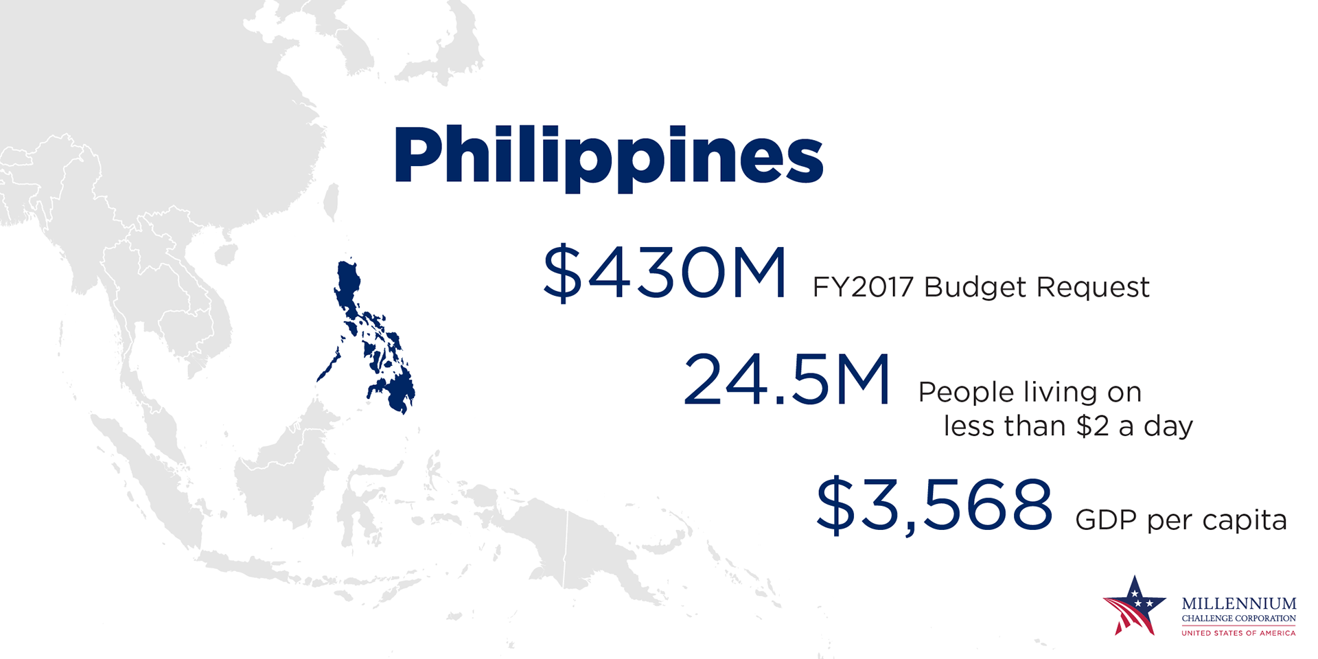
For blogs, sometimes a clever, simple visual element is all that's needed to draw attention to a big message (as above). Particularly when that content is published to coincide with an event. The blog becomes the 'learn more' space for continued engagement after the event.
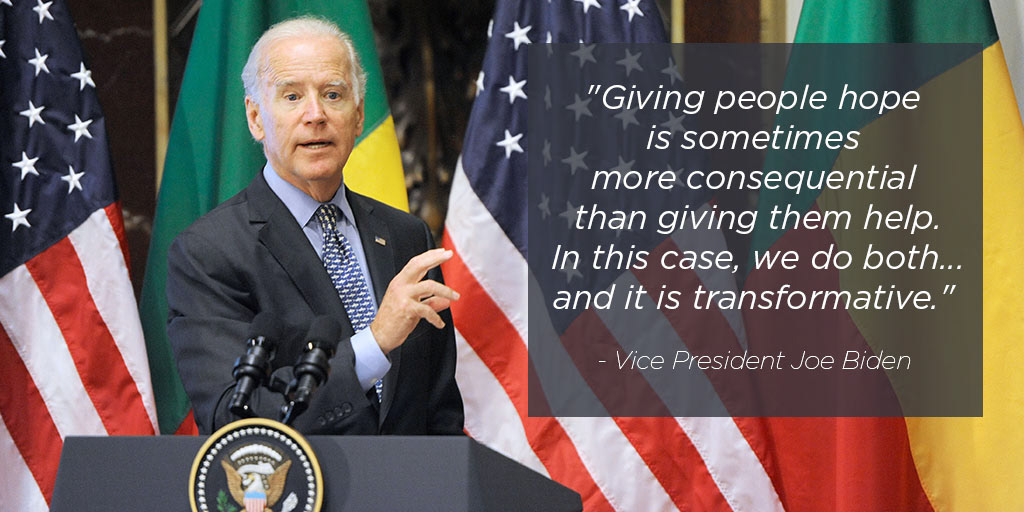
For events themselves, translating the content of the discussion to the digital space can take on many forms, from a moving message that conveys the feeling of an in-person conversation, to a powerful statement created in the moment. Both of those concepts were used during MCC's signing ceremony for the Benin partnership.

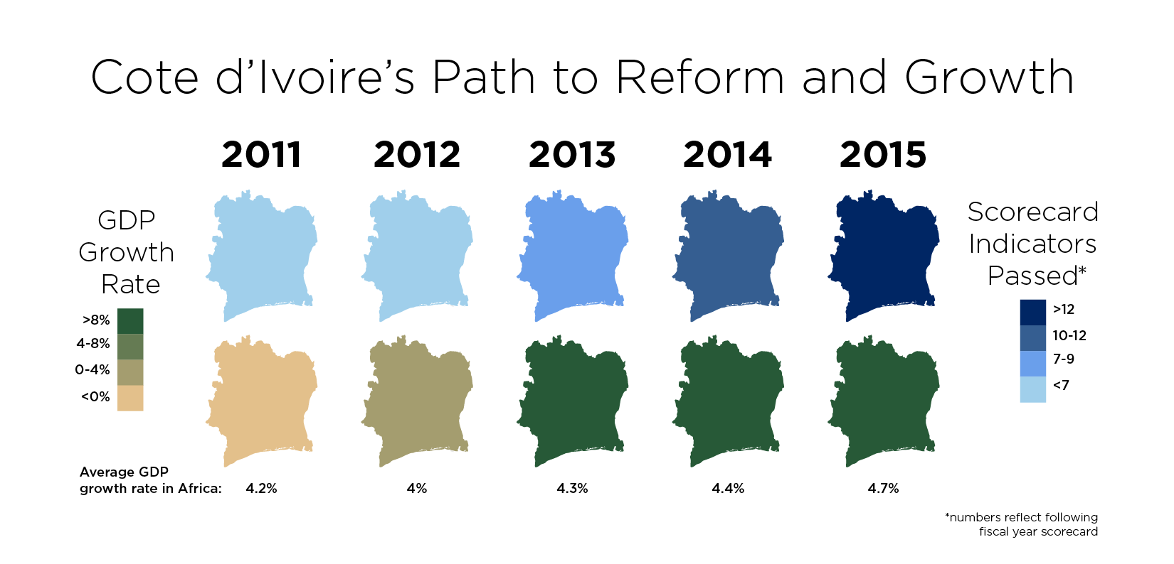
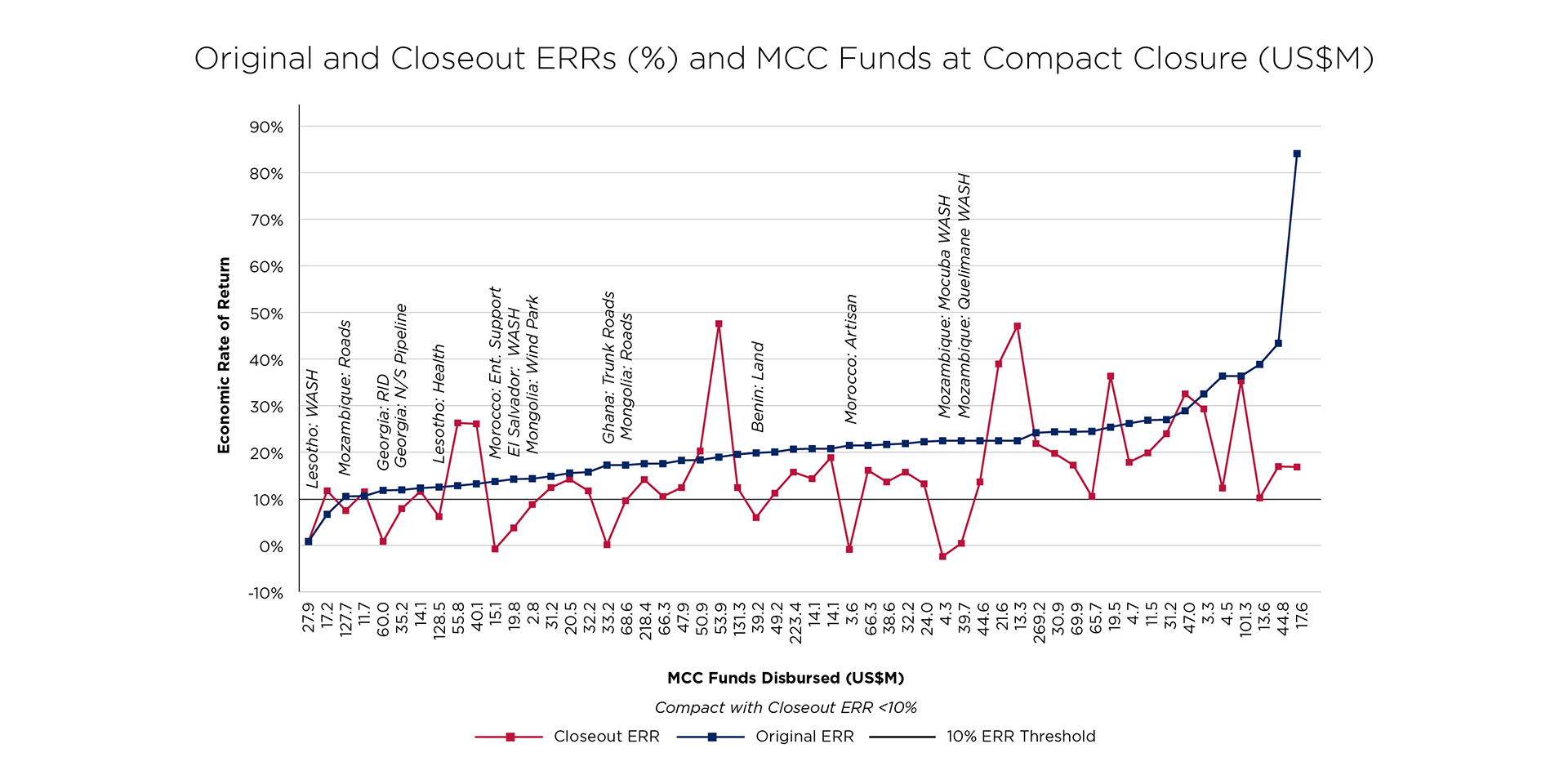
Other times, with multiple variables, the visualizations must strike a balance between compressing the information into time and space, and expanding the details to make the message comprehendible (as below).
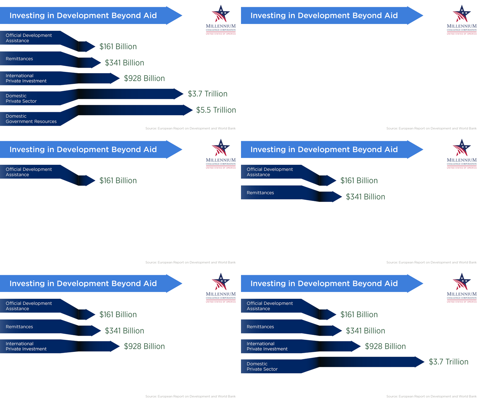
A gif will always be internet-sharable-friendly, and if your brand is wonky and smart, your gifs should be too. Especially when the punch line at the end is worth $5.5 Trillion.
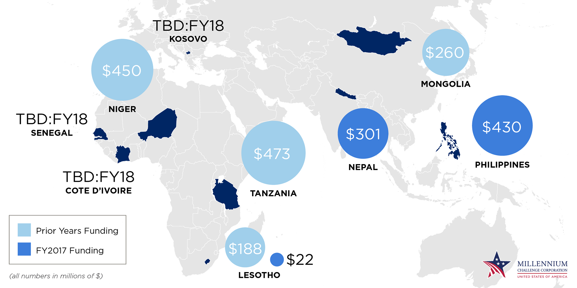
Each year, MCC must submit a Congressional Budget Justification, a pitch for funding allocations. Given the size (hundreds of millions of dollars), scope (involving many government agencies), and timelines (spanning 8 years) of our projects, this is no small task. Less allocation in a year could be the difference between a country making tangible progress out of poverty, or not. Conveying this complexity and how necessary this work is in a clear way is essential to making a successful pitch.
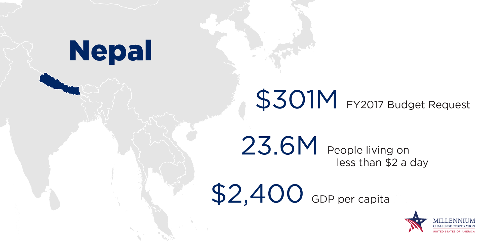

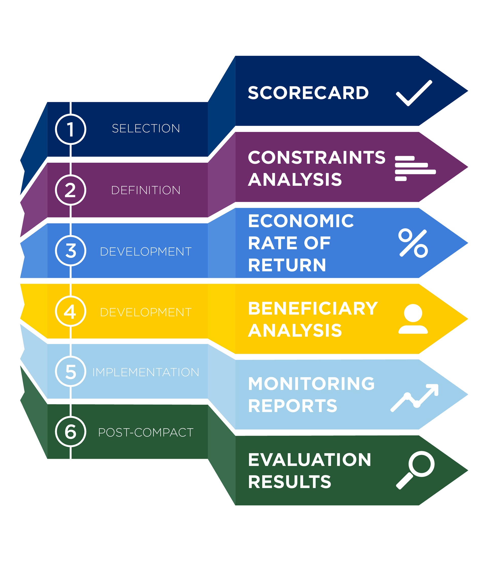
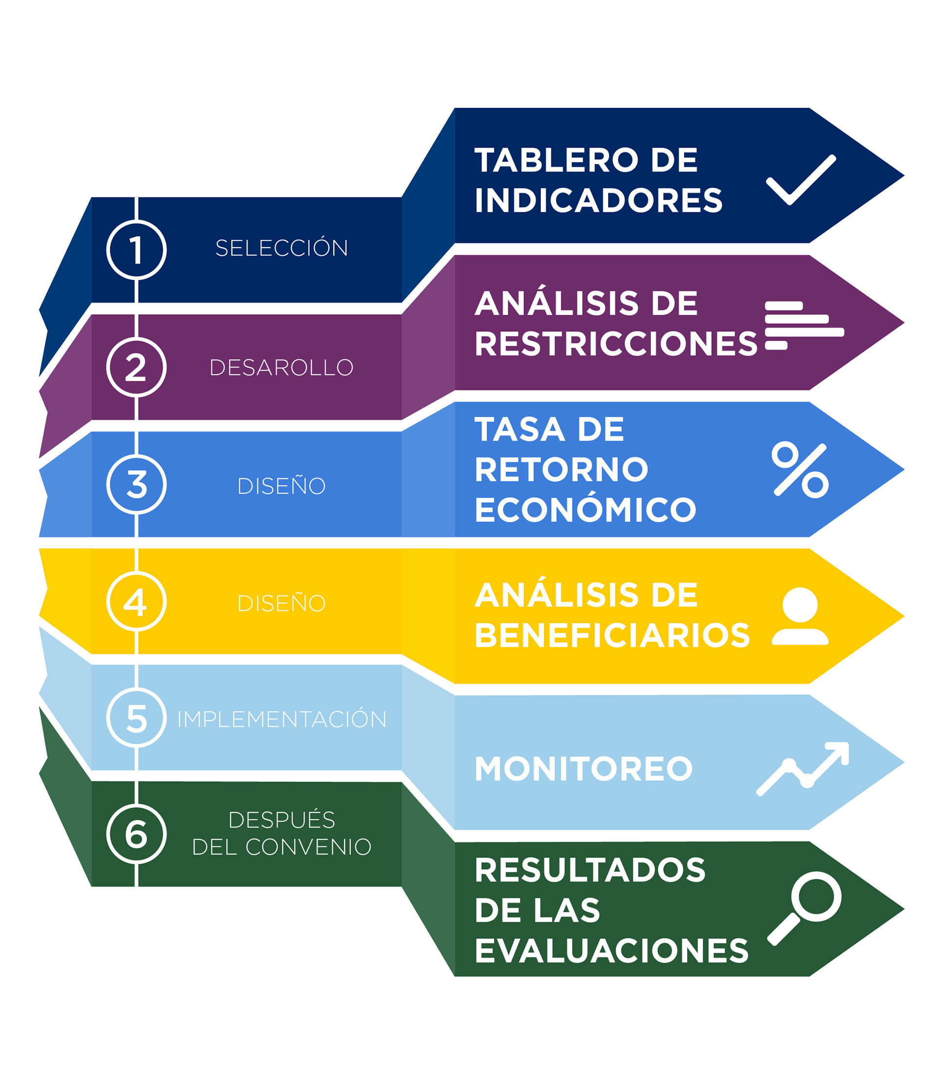
MCC's Department of Policy and Evaluation, staffed by dozens of economists and statisticians, produce scores of data. Below are the six categories (also produced in Spanish, and several other languages) that inform various stages of a project, from deciding which problems to address, to monitoring progress of those projects that can course correct to maximize impact and return on investment.
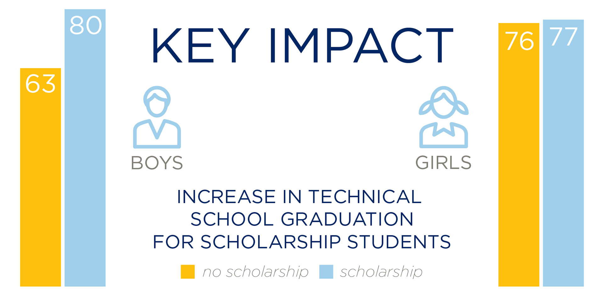
Depending on the audience, some of the data can be conveyed in stark terms, as in a graphic for our data email newsletter (Statistically Speaking).
And some audiences want all the data in one chart, which can benefit from an interactive version, too.
MCC's scorecard can be a sensitive design problem to solve. With multiple agencies negotiating on the look (from State Dept. to the White House) with a diplomatic mindset to the impact on foreign governments, even the slightest color or font change must be carefully weighed.
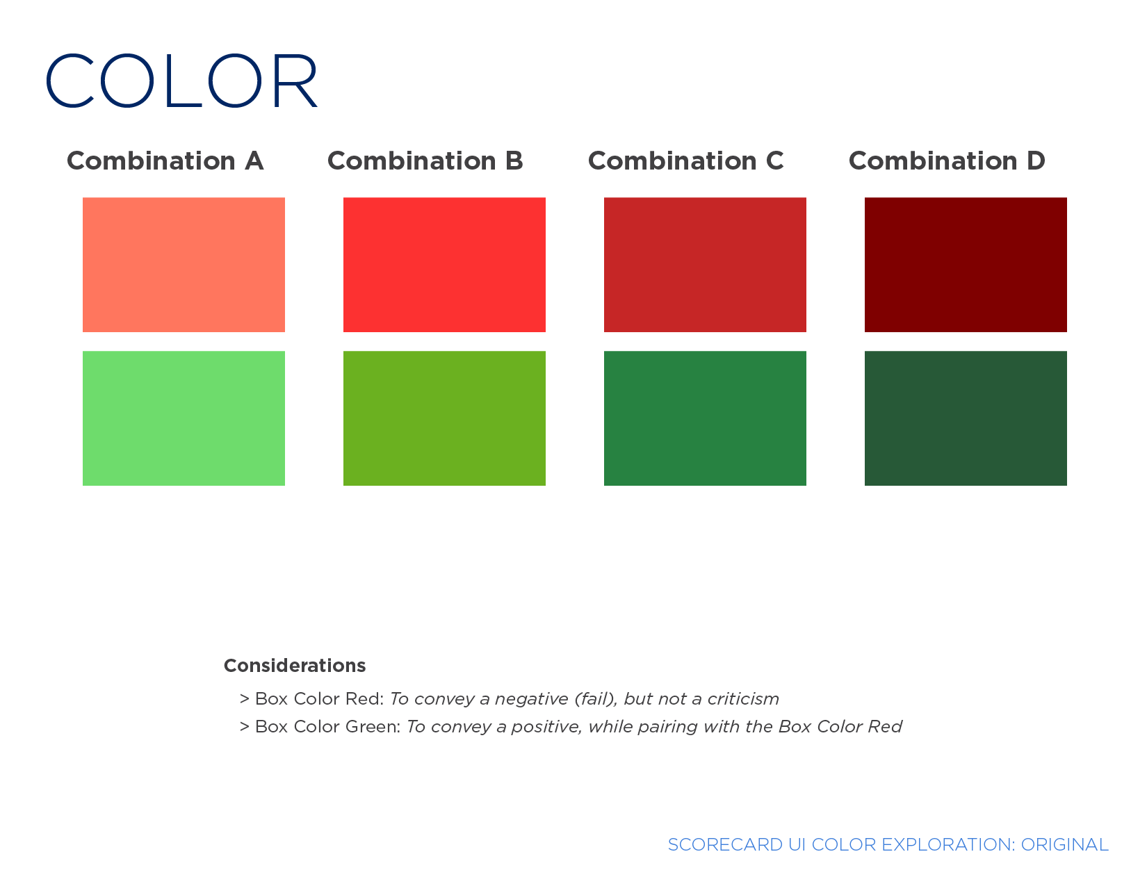
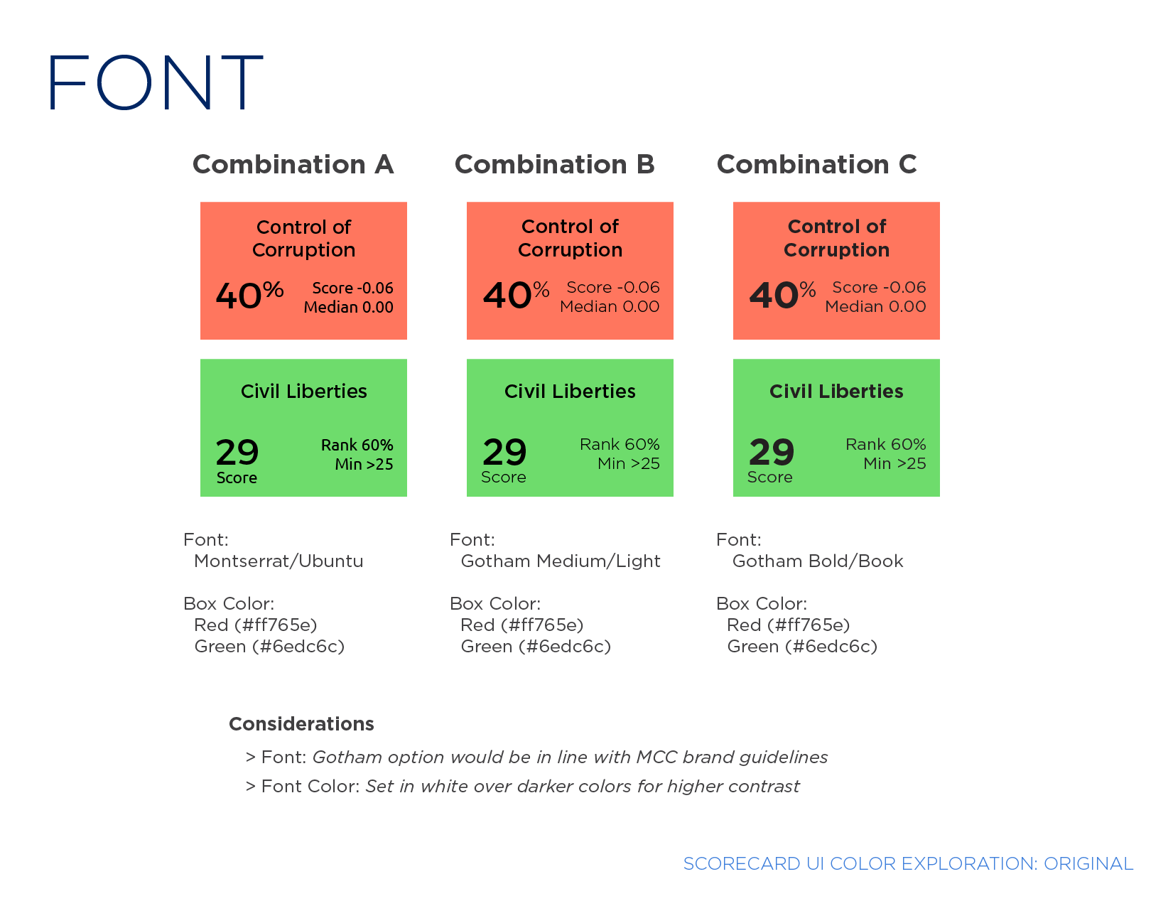
We undertook that process with very tight design parameters, as you can see in the process panels below.
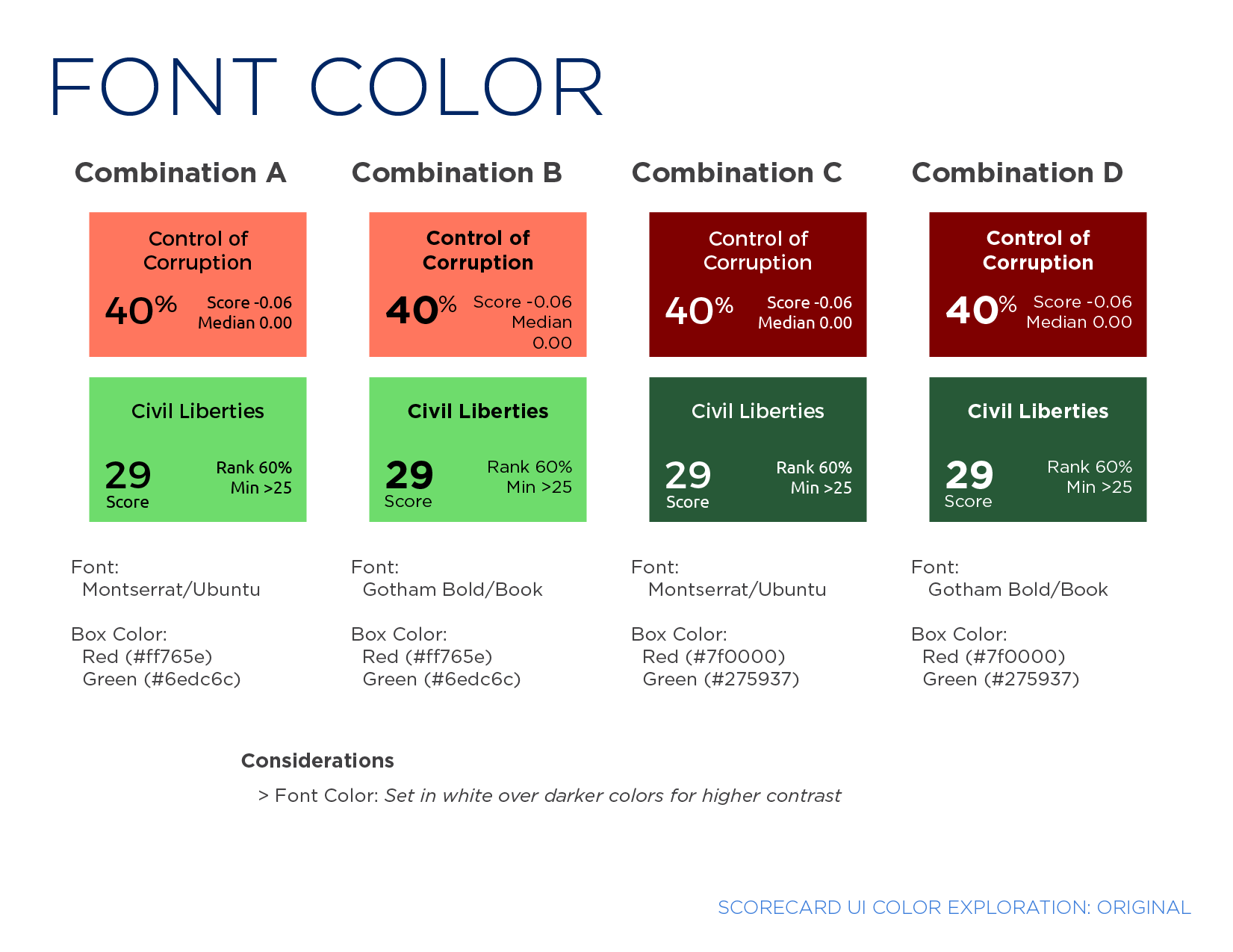
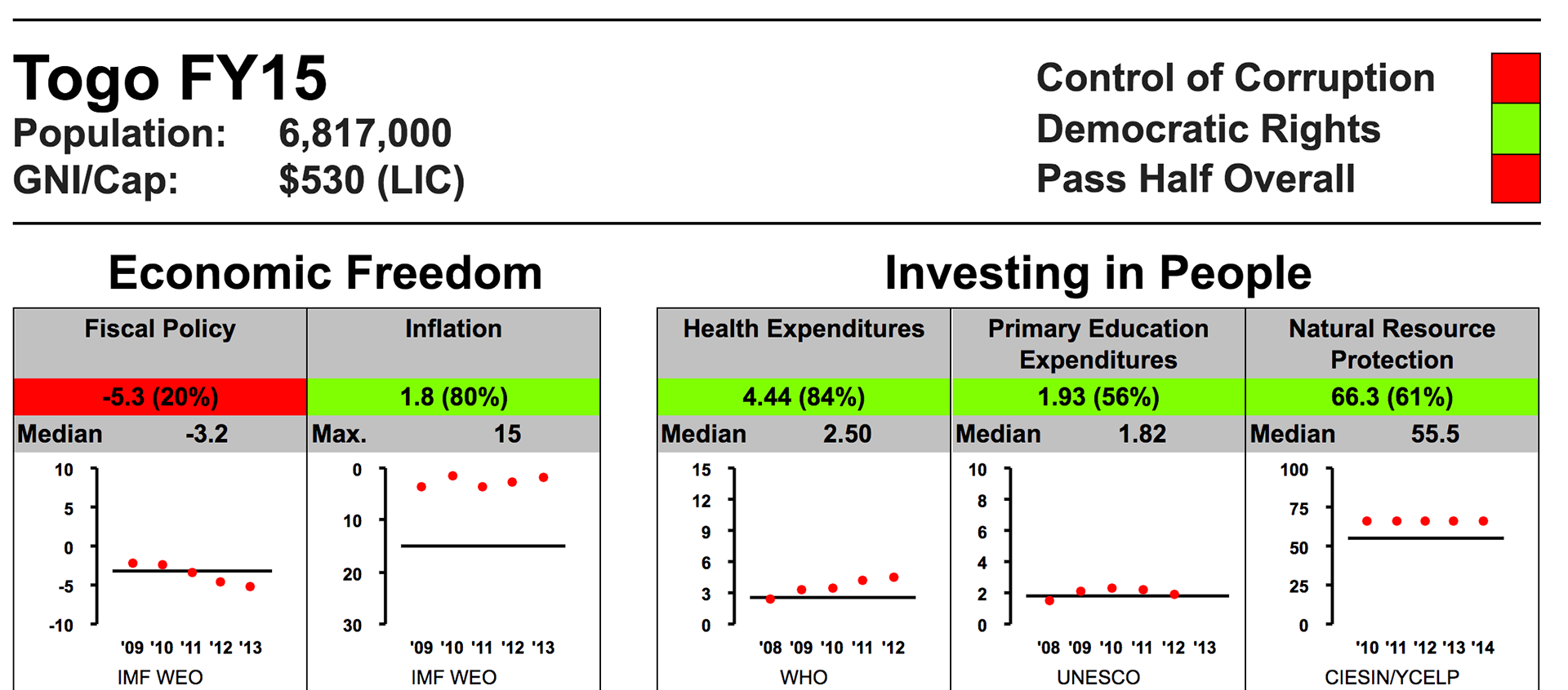
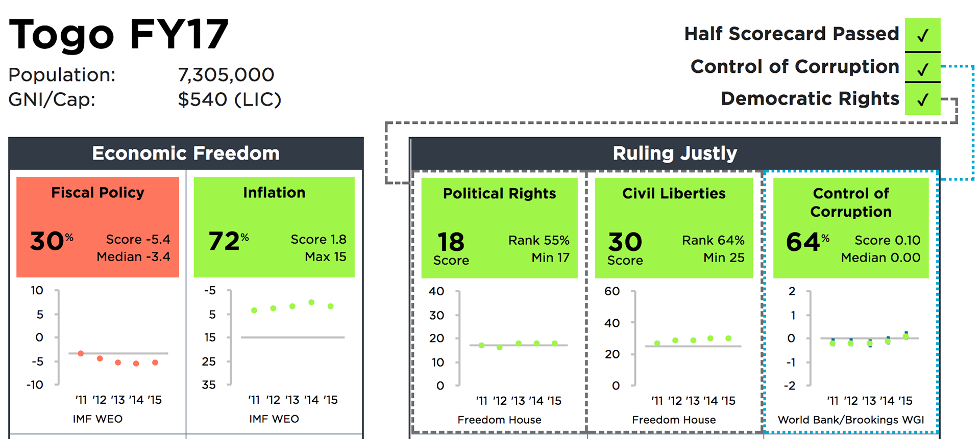
Finally, here is the before and after, which was implemented in the second year after the process started.