The USAID-EAT project performed complex, highly-technical analyses for the US government's main foreign assistance agency. The core product was a deep dive into the laws, policies, and institutions that govern the agricultural sector of countries around the world, providing suggestions that would improve the economic growth of the country.
To expand the project's exposure beyond the small group of core stakeholders, it needed to be made more accessible, approachable, and clear.
We started with the website. Originally, a 36-page site that served as more of a library archive than a proponent of the value of the work. The look, the feel, and the navigation alone was heavy and bureaucratic.

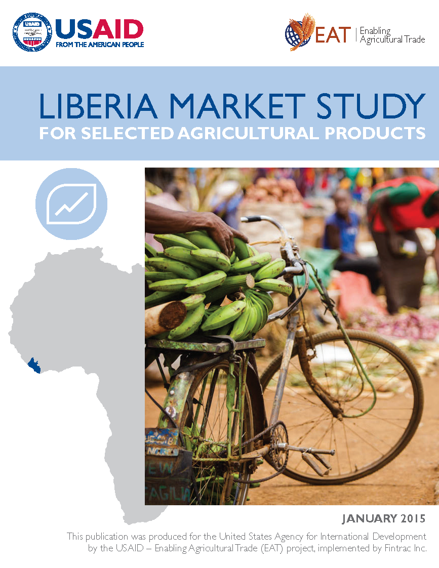
The reports were as impressive as they were long, averaging 120 pages. Further, the visual brand was multi-faceted, to the point of obscurity to an agency that manages hundreds of projects a year. The question was, how to make EAT stand out to their clients, and be more engaging to the general public.


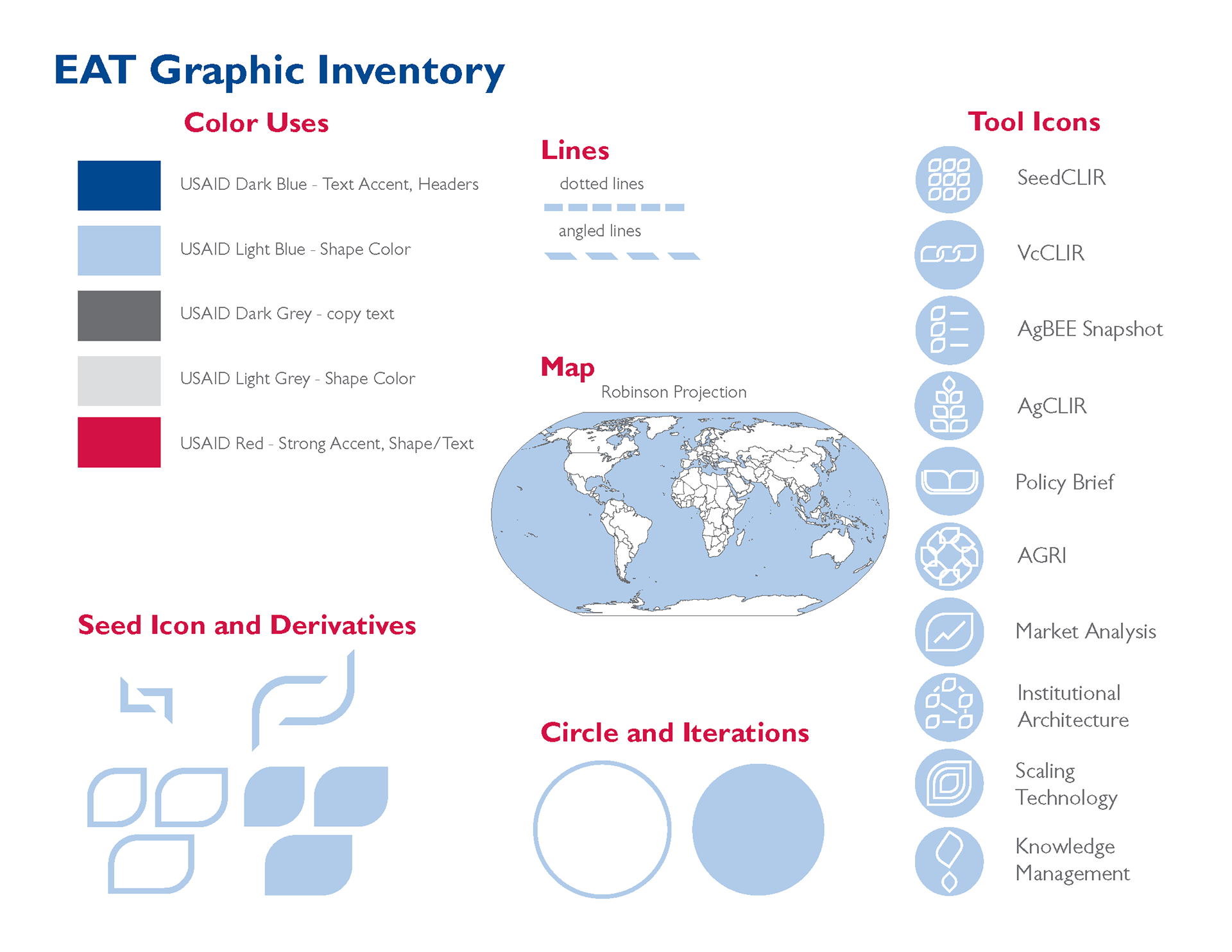
We started with a rebrand. While we were bound to colors and logos by the agency, we had the latitude to change how the colors were used, and what visuals conveyed the findings and value of the work.
The EAT project had a number of analytical products. A consistent style was applied to a differentiated set of icons that marked each product. The prescribed colors were explicitly defined, and design elements were clarified that would create a consistent and unique pattern that would set the EAT project apart from its competitors.
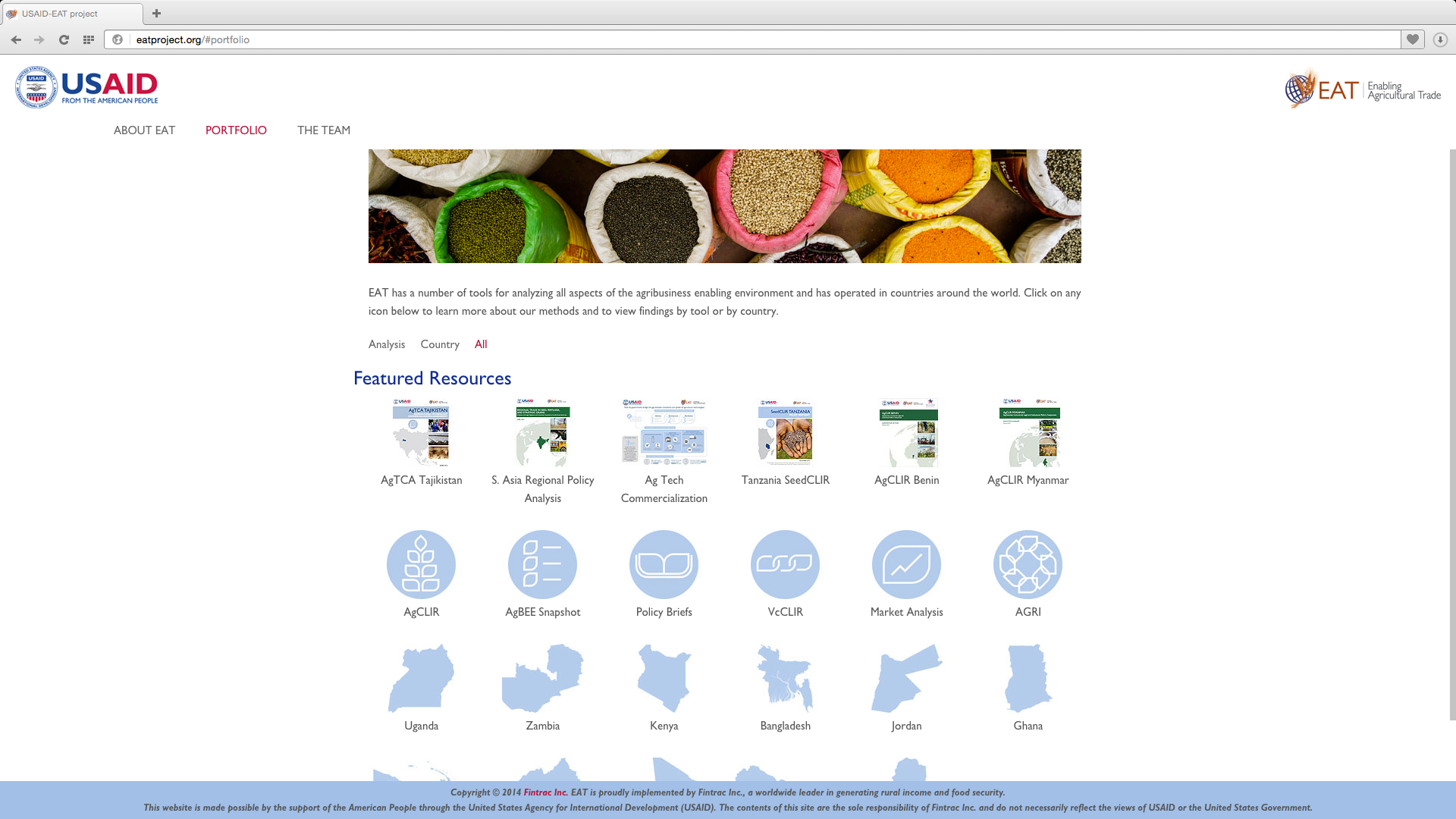
The website was redesigned from the ground up. After reviewing the analytics of the old site, we discovered that 90% of the traffic was only to three pages. So, we consolidated the archive into a modern site, simplifying the navigation and expanding the patterns defined above for consistency across print and digital branding.
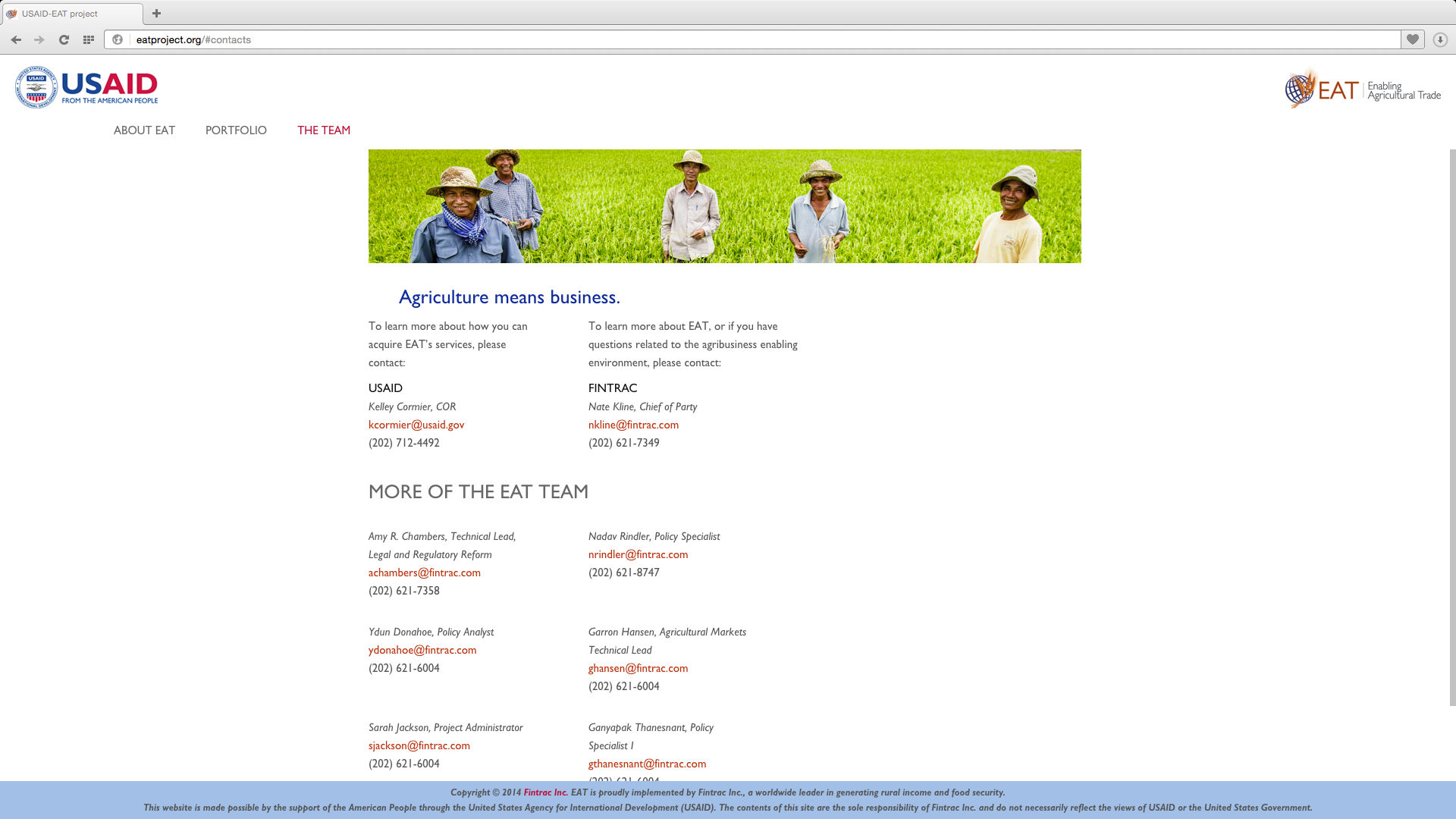
The remaining 10% of web traffic was captured through a personal team directory -- this made sense as personal contacts drove most of the project business anyway.


We turned to the print reports, again driving the refreshed brand for a more accessible and lighter feel. Larger images and a bolder font kept the strength the products demanded, but in a way that quickly and simply conveyed the purpose of the report, and why it mattered.

Finally, we even turned turning some of the longer reports into single-page infographics for quick distribution through print at events, on social media, and on the website. With the many layers of information, these infographics required careful distillation of the key value derived from the analyses. Ultimately, these became the most requested communications materials of the project, serving as a gateway into deeper engagement with the brand.

